Most homeowners meet your landscaping company on a phone first. If the mobile version of your site is slow, cluttered, or hard to tap, you lose the lead before they ever see your work. These six mobile-responsive design tips fix that.
Mobile traffic now drives the majority of internet usage, and home services are no exception. Someone notices a freshly landscaped yard, pulls out their phone, and starts searching. The site they land on has a few seconds to look credible and make the next step obvious.
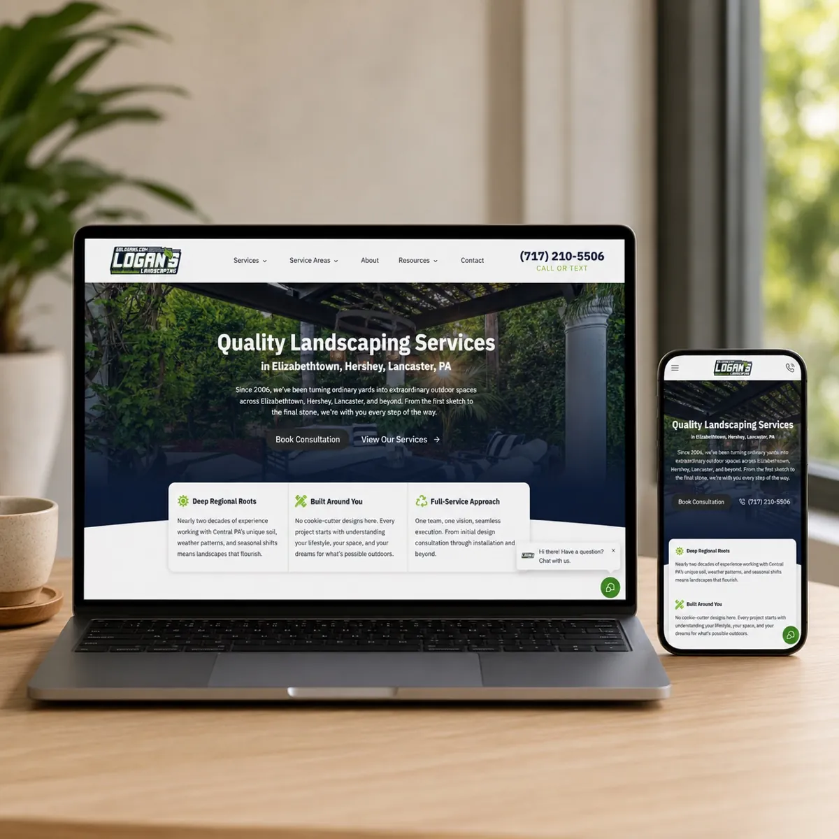
A mobile-responsive design adapts to whatever screen size a visitor is on, so your photos, services, and contact button stay easy to read and easy to use. That is not just a nicer experience. It is what makes your business look professional to a homeowner who is comparing you against the next landscaper in the search results.
On mobile, the bar is simple: can a homeowner understand what you do, see proof, and reach you in a few taps? If any of those break, the lead leaks.
1. Make your mobile-responsive design the priority
Build and judge your site on a phone first, not a desktop. The desktop layout often looks fine while the mobile version is where the problems hide: text too small to read, buttons too close together, images that push the contact form far down the page.
When the mobile experience is smooth, you capture a larger share of the people already searching for your services. A clean phone experience leads to more engagement, more form fills and calls, and ultimately more booked jobs.
2. Use clear, compelling calls-to-action
When a homeowner lands on your site, they should immediately understand the next step. A strong call-to-action removes the guesswork and points them toward booking an estimate or reaching out. A few things make CTAs work harder on mobile:
- Use action-oriented language. Verbs like "Get a Free Quote," "Contact Us," or "See Our Work" tell people exactly what happens next.
- Place CTAs strategically. Keep them visible and in the natural flow of the page so a visitor never has to hunt for the next step.
- Create contrast. Use a button color that stands out from the rest of the page so it is obviously tappable.
- Keep it simple. One clear ask beats a cluttered button crammed with extra text.
- Test and refine. Try different wording and placement to see what earns more calls and form fills.
3. Optimize images for speed
Landscaping is a visual business, so your site is image-heavy by nature. That is exactly why images are usually the biggest drag on mobile load time. The goal is to keep your work looking sharp while the page still loads fast.
Image compression techniques
- Use lossless compression to cut file size without losing visible quality.
- Choose the right file format. JPEG (or WebP) for photographs, PNG for graphics that need transparency.
- Resize images for the web. Scale photos to the dimensions they actually display at instead of uploading full-resolution files.
- Use an image CDN to deliver photos faster across different locations and devices.
Lazy loading
Lazy loading means images load only as a visitor is about to scroll to them, rather than all at once when the page opens. That cuts the initial load time and saves data, especially on a page full of project photos.
To do it well, set proper image dimensions, use lightweight placeholders, and prioritize the content above the fold so the top of the page appears instantly while the rest loads as needed.
4. Simplify navigation for users
On a small screen, complicated menus are a fast way to lose a visitor. The goal is to help someone find what they need with as little effort as possible.
Clear menu options
- Use descriptive labels for each menu item, like Services, Gallery, and Contact.
- Keep the menu structure simple and intuitive.
- Make sure the menu is easy to reach from any page.
- Include a search option for visitors who want to jump straight to something.
- Prioritize your most important services so they are front and center.
Minimal clicks required
Aim to get a visitor to any key page in as few taps as possible. Dropdown or sliding menus help keep things tidy without burying your services or contact details several layers deep.
Use familiar icons
Recognizable icons make a mobile site easier to scan. Pick commonly understood symbols, keep the design clean, stay consistent across the site, and add a short label or tooltip where an icon might not be obvious on its own.
5. Use white space effectively
White space is the empty room around your text, photos, and buttons, and it does real work. It improves readability, gives the page a more professional feel, and draws the eye toward the elements that matter most.
Used well, generous spacing around a call-to-action button or your contact information helps direct a visitor's focus and makes them more likely to act. Avoid the opposite mistake: cramming too much onto one screen overwhelms a mobile visitor and pushes them away. Mind the spacing between text, images, and other elements, and let the important things stand out.
6. Test across multiple devices
Your site can look perfect on your own phone and still break on someone else's. Testing across a range of devices is what confirms it actually works for the homeowners trying to reach you.
- Check device compatibility. Test on different phones, tablets, and operating systems for consistent performance.
- Evaluate the user experience. Watch how the site behaves on each device and look for anything awkward to tap or read.
- Run performance tests. Check load speed on different devices so it stays fast, not just functional.
- Verify screen sizes. Confirm your content displays correctly across small and large screens.
- Use responsive design tools. Browser developer tools and online emulators let you preview common screen sizes before a visitor ever sees the site.
Key takeaways
- Treat mobile as the primary experience, because that is where most of your leads start.
- Use clear, strategically placed calls-to-action that make the next step obvious.
- Compress and lazy-load images so a photo-heavy site still loads fast.
- Simplify navigation so a homeowner reaches what they need in a few taps.
- Use white space to improve readability and guide attention toward booking.
- Test across real devices to confirm everything works in the wild.
Want a website built to win mobile leads?
If your landscaping site is hard to use on a phone, you are losing homeowners before they ever see your work. Let us look at how your site performs on mobile, where leads are slipping, and what it would take to turn that first tap into a booked estimate.
Frequently asked questions
Why does mobile-responsive design matter for landscapers?
Most homeowners search for a landscaper on their phone, so the mobile version of your site is the first impression for the majority of your leads. A responsive design adapts to any screen size, which keeps your photos, services, and contact button easy to use and makes your business look credible to someone ready to book an estimate.
How can I make my landscaping website faster on mobile?
Image weight is usually the biggest issue. Compress your project photos before uploading, size them to the dimensions they actually display at, use modern formats like WebP, and turn on lazy loading so images load only as a visitor scrolls to them. These steps cut load time without hurting how your work looks.
What makes navigation easy to use on a mobile landscaping site?
Keep the menu short and use plain labels like Services, Gallery, and Contact instead of clever names. Reduce the number of taps it takes to reach a key page, use familiar icons such as a phone or menu symbol, and keep your phone number and quote button within easy reach on every page.
How do I know if my landscaping website actually works on phones?
Test it on real devices, not just your own. Check different phones, tablets, and screen sizes, confirm the buttons are easy to tap and the text is readable without zooming, and run a speed test on mobile. Browser developer tools and online emulators help you preview common screen sizes before a homeowner ever sees the site.